
Case Study 04 — E-Commerce · UI/UX · Web Design
Bloom & Co is a full e-commerce website for a premium floral delivery brand serving Riga and Rēzekne. The brief was clear: build something that feels romantic, premium and effortless — from the first scroll to checkout.
I designed and built every page from scratch — homepage, shop, product detail, subscriptions, occasions, about, and contact — as a cohesive, fully responsive system in pure HTML and CSS. No frameworks, no templates.
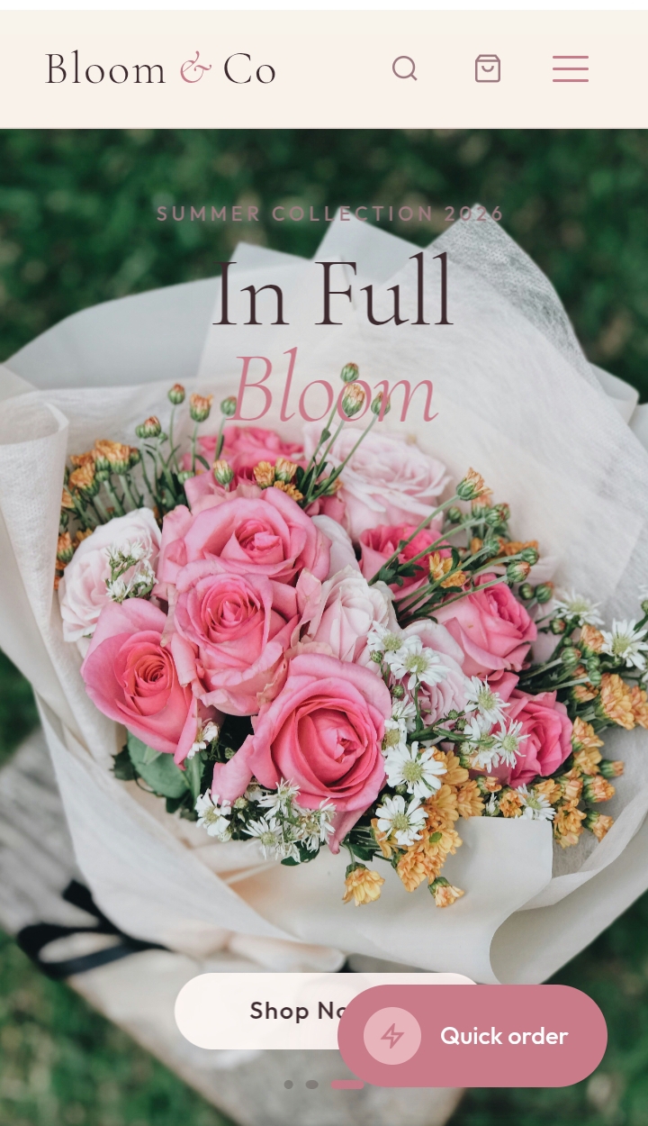
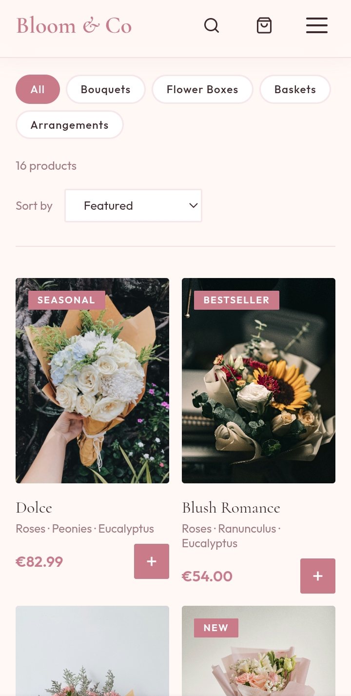
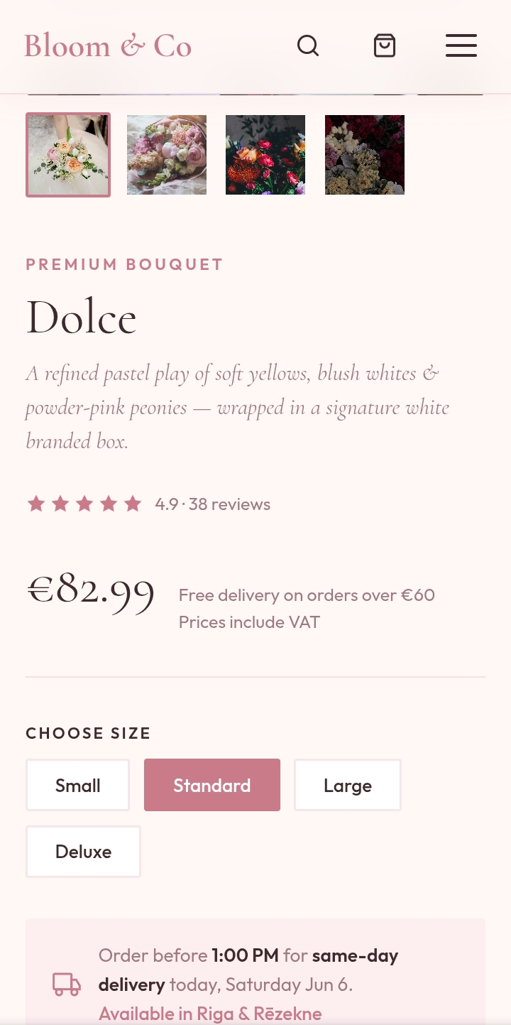
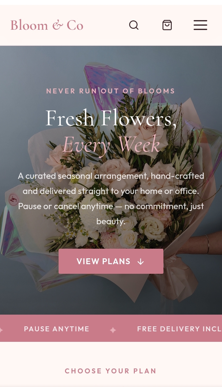
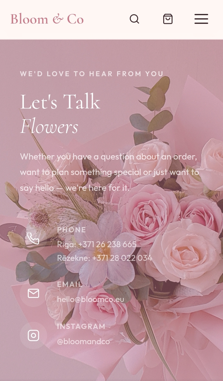
The palette draws from pressed petals and parchment — blush pinks, dusty rose, warm ivory. Nothing dark. Nothing cold. Every colour decision was made to feel like you're holding a bouquet, not browsing a website.
Cormorant Garamond was chosen for its delicate contrast and editorial elegance — the right font for a brand that sells beauty. Outfit handles all UI text: clean, geometric, and entirely readable at small sizes.
Every interactive element uses SVG icons — no emoji, no icon fonts, no external dependencies. The site is fully self-contained and deployable as static files on GitHub Pages.
Quick Order floating button. A persistent rose-coloured pill in the bottom-right corner opens a spring-animated popup — "Not sure what to choose?" — giving hesitant visitors a low-friction path to the florist. Inspired by the original aiflowers.lv UX, redesigned with a lighter, more romantic feel.
Hero carousel with ken-burns. Three full-viewport slides with subtle image zoom, touch swipe on mobile, dot navigation, and auto-advance every 5.5 seconds. Text floats at the top; the shop CTA pill anchors to the bottom — exactly where the thumb lands.
Subscription frequency toggle. Switching between weekly, bi-weekly and monthly updates all prices in real time without a page reload. A small interaction that builds immediate trust.
Product gallery switcher. Four thumbnails, smooth opacity-fade transitions, sticky on desktop. The add-to-cart button turns sage green with a checkmark on click — instant feedback, no page jump.
Mobile-first throughout. Hamburger drawer with animated lines, 2-column product grids, stacked hero on small screens, and touch-swipe on the carousel. Tested at 360px to 1440px.
The complete website was designed and built in pure HTML, CSS and vanilla JavaScript — no React, no Tailwind, no libraries. Seven fully responsive pages, a coherent design system, and a live deployment on GitHub Pages. Every pixel deliberate, every interaction considered.
This was a self-initiated project conceived as a portfolio piece demonstrating full end-to-end product thinking: from brand palette and typography, through information architecture, to interactive micro-details and mobile UX.