Case Study 03 — Lifestyle Brand · Web Design
Rento is a Finnish sauna accessories brand with deep roots in Finnish sauna culture — buckets, ladles, textiles, cosmetics and scents crafted for people who treat the sauna as a sacred ritual. Their philosophy: "The Harmony of Sauna." Their tagline: a way of life, not a product category.
The original Rentosauna.fi site was built on a standard WordPress theme. Clean enough, but generic — a product catalogue that happened to sell sauna goods. It had no atmospheric quality, no editorial voice and no visual identity that matched the meditative depth of what Rento actually stands for. The photography was good but imprisoned in a layout that gave it no room to breathe.
A brand that talks about stillness, ritual and harmony deserved a website that made you feel those things before you read a single word.
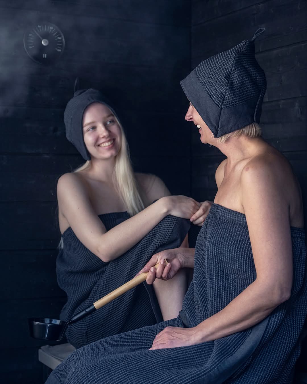
The redesign started with a question: what does the harmony of sauna feel like? Warm. Dark. Quiet. Unhurried. Every design decision flowed from that answer.
The hero opens with an autoplay video — steam rising, water pouring over stones — the most primal sauna moment. The brand name appears over it simply, in refined typography. No hero carousel, no promotional banner, no instant product push. Just atmosphere first.
The navigation was completely rebuilt. The original site buried categories in a long dropdown. The redesign organises everything into a structured mega-menu — Products, Collections, Articles, Info — that opens cleanly and guides the eye without overwhelming it.
Products are presented as curated collections with editorial photography, not grid dumps. A "Top Products" section surfaces the bestsellers elegantly. An "Our Collections" grid — Rento × Harri Koskinen, Buckets, Textiles, Scents, Cosmetics — gives each category a visual identity rather than just a label.
An Articles section was built to house Rento's existing content library — over 16 articles on sauna culture, sustainability, and product stories — elevating the brand from retailer to authority.
Video hero, not static image. A looping atmospheric video of sauna ritual replaces the generic WordPress homepage banner. It creates immediate immersion — you feel the brand before you read it.
Dark, warm palette. Most wellness and lifestyle product sites default to clinical white. Rento's world is firelight, steam and birchwood — a deep charcoal and amber palette felt true to the experience and created immediate visual differentiation.
EN | FI language toggle built in. Rento sells in both Finnish and international markets. Language switching is persistent across all pages — seamless, not an afterthought.
Articles as brand positioning. Rento already had a rich content library. The redesign gives it a dedicated editorial section with proper tags, pagination and a magazine-style layout — positioning Rento as the authority on Finnish sauna culture, not just a seller of sauna products.
Partner logos section. The redesign surfaces Rento's retail partnerships — 11 major partners — as a trust signal that the original site buried or omitted entirely.
The palette is drawn directly from the Finnish sauna — dark wood, birch bark, natural stone and steam. Warm neutrals that feel tactile and honest. Nothing bright, nothing digital. Every colour decision was made to feel like the moment you step inside.
Playfair Display sets the editorial tone — its warmth and weight echo the craftsmanship of Finnish sauna culture. DM Sans handles product UI and body text with clean, modern legibility.
The redesigned Rento site achieves what most lifestyle brand sites fail to do: it makes you feel something before it tries to sell you something. The atmospheric video hero, dark warm palette and editorial product presentation create immediate brand differentiation that the original WordPress theme could not.
Every page — from individual product detail pages to the full articles library — was custom built and deployed live on GitHub Pages. The site is fully bilingual, mobile-first, and structured to grow as Rento's content library expands.
This project demonstrates my ability to translate a brand's intangible philosophy — in this case, the Finnish concept of sauna as sacred ritual — into a digital experience a visitor can actually feel.