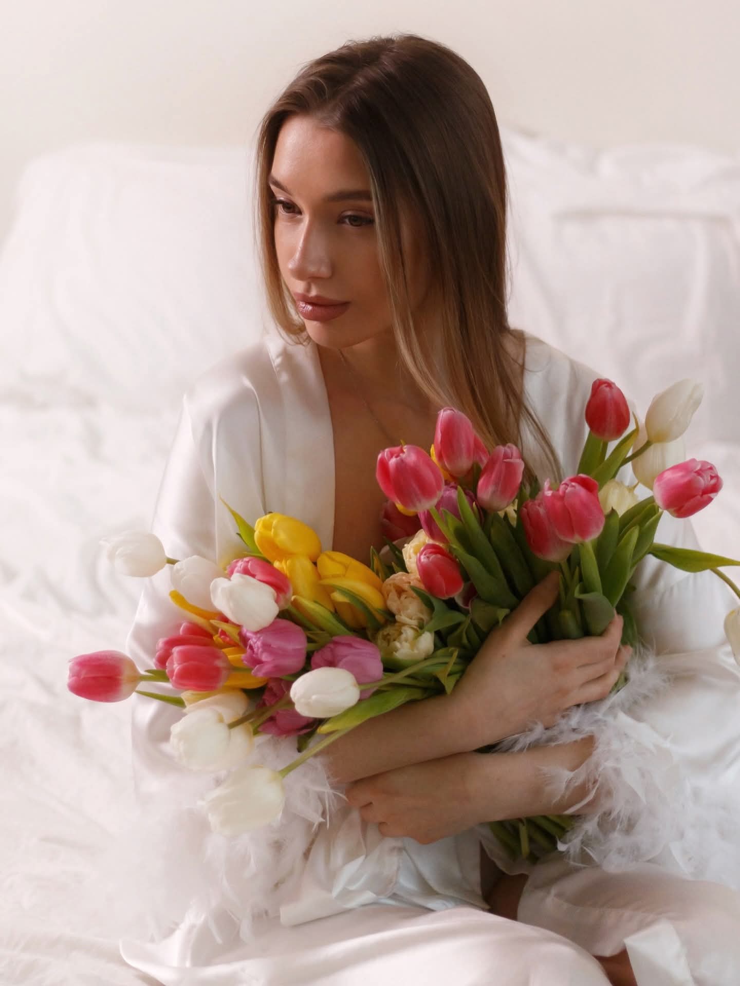
Case Study 01 — E-Commerce · UI/UX Design
Krokus is one of Riga's most beloved floral studios — master florists with over a decade of artistry, 3,400+ five-star reviews, and 24/7 service. Their flowers are exceptional. Their website was not.
The original site was dense, SEO-heavy and visually chaotic — emoji-laden headlines, cluttered product pages, outdated typography, and a layout that felt closer to a classified ad than a premium atelier. The brand's real identity — romantic, artisanal, Latvian — was completely invisible.
Visitors with real buying intent were bouncing before they ever saw the flowers.
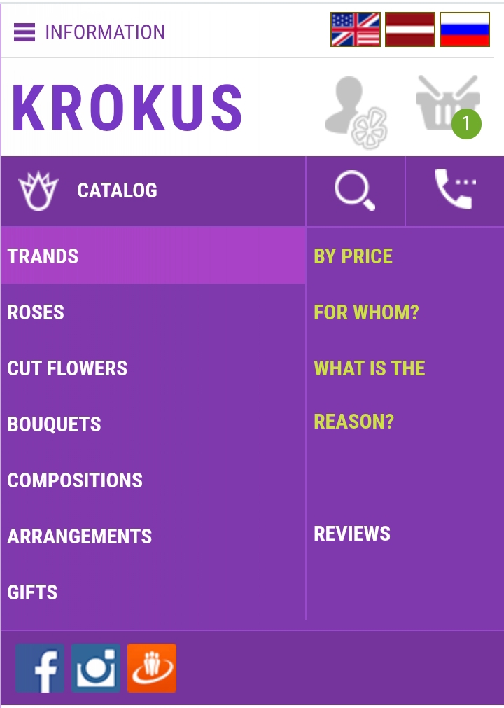 Before
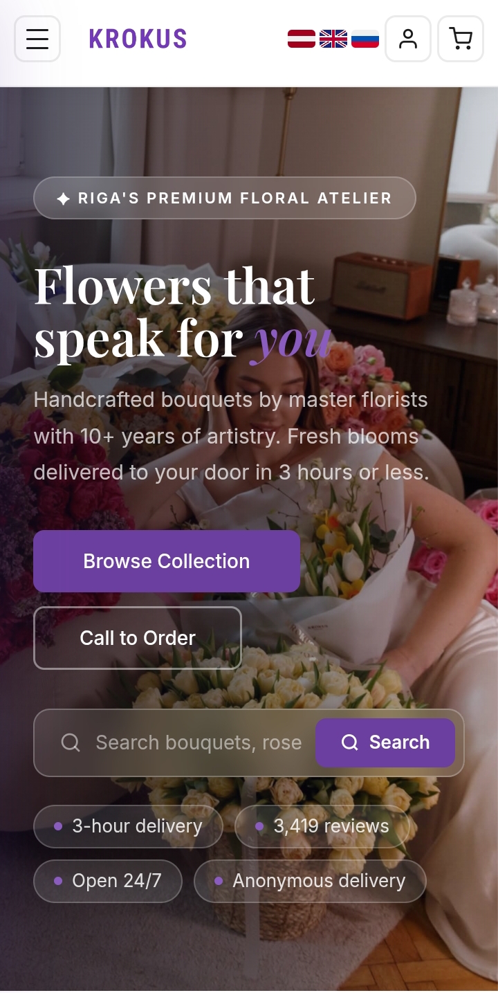 After
AfterFlowers are never really about flowers — they're about what you feel when you send them. The redesign started there.
I rebuilt the visual language from the ground up: a refined purple and white palette that felt premium without being cold, an editorial hero that opens with atmosphere rather than a product dump, and a navigation system simplified to guide buyers from mood to bouquet in as few steps as possible.
The product cards were completely rethought — real photography, clear pricing, one-tap ordering, and "Bestseller" / "Popular" badges to reduce decision fatigue. A flower subscription section was added to capture recurring revenue. The mobile experience was rebuilt from scratch, since over 70% of flower orders are placed from a phone.
Hero as a feeling, not a catalogue. The redesign opens with a full-screen atmospheric image and a single emotional headline — "Flowers that speak for you."
Purple as a luxury signal. The accent colour shifted to a deep, considered purple — associated with prestige, femininity and romance. Paired with white space, it reads as premium.
Reducing friction at checkout. "Quick Order →" cards allow buyers to act on impulse without navigating away from the browsing experience.
Trust built through social proof. A curated reviews section and photo gallery from real deliveries were added to reinforce quality at the exact moment a buyer is deciding.
The palette draws from twilight and royalty — deep plums and velvet violets that signal premium without shouting. Paired with generous white space, it feels like a high-end atelier, not a discount shop.
Playfair Display brings romantic editorial weight to headings — the right serif for a brand that sells feeling. DM Sans handles all UI text: legible, clean, frictionless at any size.
The redesigned Krokus presents a brand that finally reflects the quality of its product. The visual hierarchy guides emotion before decision. The mobile experience removes all friction. The new subscription model opens a recurring revenue stream the original site didn't have at all.
This was a cold email project — Krokus never asked for this redesign. I sent them a vision of what their brand could be. The work speaks for itself.