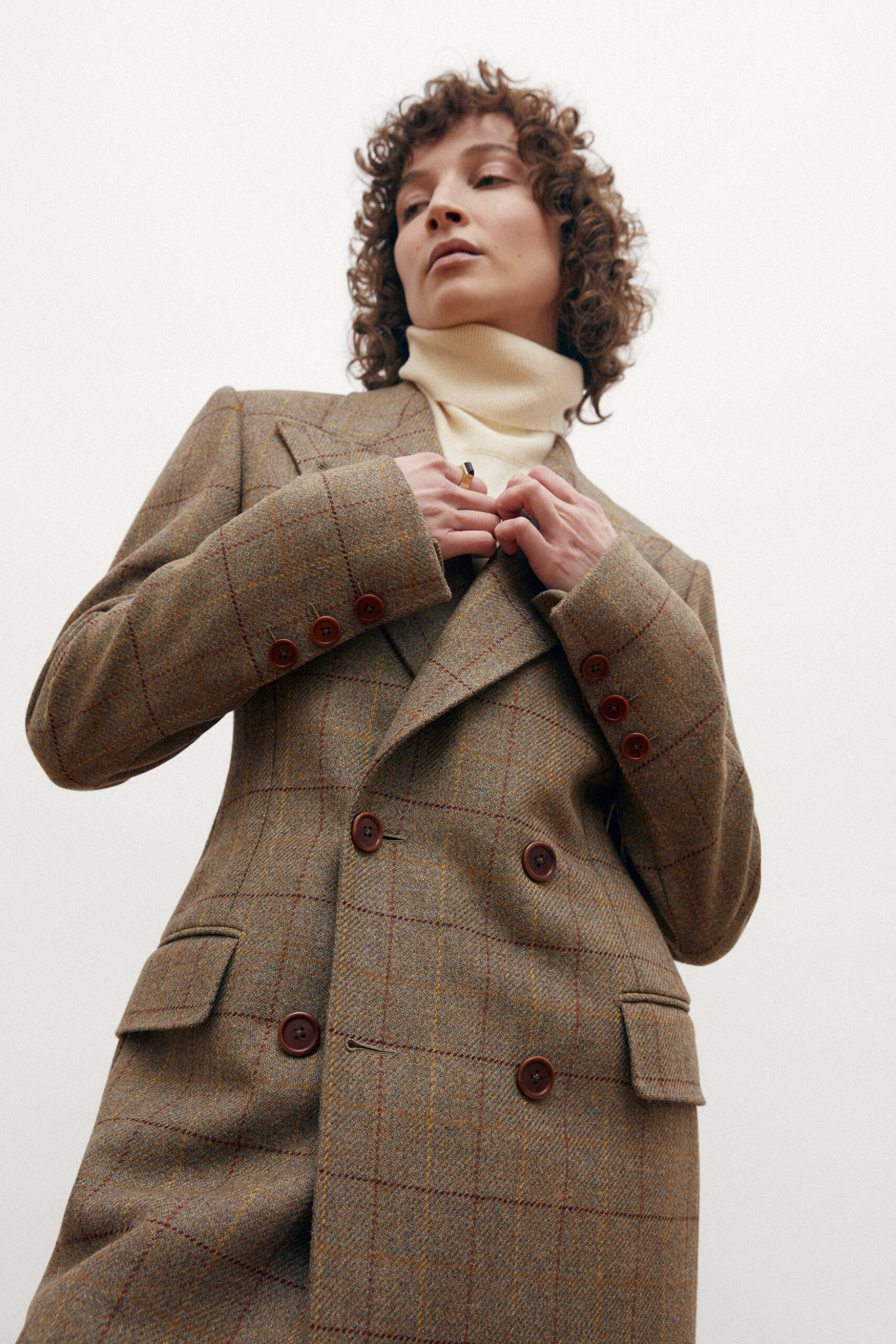
Case Study 02 — Luxury Fashion · Web Redesign
Agnes Nordenholz is a Berlin-based atelier creating made-to-measure pantsuits and artisanal bags for women — designed with precision, tailored in Italy, made to last a lifetime. The brand philosophy is "Slow Luxury": considered craftsmanship over seasonal trend.
But the original website told a different story. Built on WordPress with standard e-commerce templates, it was visually busy, typography-heavy in the wrong places, and lacked the editorial calm that a brand of this calibre demands. A visitor could feel the quality of the product — but the site never gave them space to feel anything at all.
The navigation was also overcrowded, making discovery difficult in a collection built on discoverability.
 Before
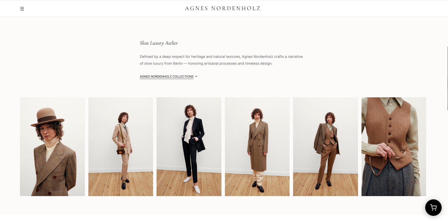 After
AfterThe redesign was built around one principle: let the garments breathe. In high-end fashion, what you don't show is as important as what you do. Negative space became the primary design tool.
I stripped the navigation back to its essentials — Clothing, Bags, Interior, Jewellery, Custom Made, Story — and rebuilt it as an elegant dropdown system that reveals only when needed. The homepage was reconceived as an editorial sequence: a cinematic hero, a curated grid of product categories, a brand philosophy section, and a journal preview.
The typography system was rebuilt around a single serif family — clean, refined, and scalable — with generous line heights and careful hierarchy. The colour palette reduced to warm white, charcoal and natural paper tones reflecting the brand's material language: linen, leather, wool.
Editorial photography first. Each section opens with a full-width image before any text. The garments lead — copy supports.
Designed in Germany, tailored in Italy. This brand line — already in the brand language — became a recurring typographic element throughout the site, anchoring the positioning statement in the visual design.
The custom-made process, made visible. A dedicated process page was designed to walk clients through consultation, fittings and delivery — building trust before a single suit is commissioned.
Mobile as editorial, not utility. Most luxury brands treat mobile as an afterthought. This redesign treated it as an opportunity — vertical editorial layouts that feel like leafing through a beautifully printed catalogue.
The palette mirrors Agnes Nordenholz's material language exactly — paper white, linen, greige, stone and graphite. Six shades of almost-nothing that together create unmistakable luxury. Nothing garish, nothing digital. Every colour decision was made to feel like holding a printed lookbook.
Playfair Display was chosen for its editorial refinement — generous contrast, elegant italics, and a quiet authority that matches the brand's slow luxury positioning. DM Sans keeps navigation and product UI effortlessly readable.
The redesigned Agnes Nordenholz finally communicates what the brand has always been: a quiet, confident luxury house. The visual system is cohesive, the navigation is intuitive, and the editorial rhythm matches the considered pace of the product itself.
This was a cold email project — unsolicited, self-initiated, and built entirely on conviction. It demonstrates exactly what I do: identify a gap between a brand's reality and its digital presence, then close it.